PANTONE COLORS OF THE YEAR 2021- ULTIMATE GRAY AND ILLUMINATING YELLOW
Publication 21.04.2022Since 20 years every December, Pantone Color Institute - the global color authority announces the color of the year for the next 12 months. The chosen color is not only a clear direction for designers, brands and advertising agencies, presenting them the way of the visual trends development over the next year, but is also a response to consumer moods, desires and hopes.
What is the Pantone color of the year 2021?
Each year, only one color of the year is selected but in case of 2021 (similarly to 2016) Pantone made an exception and announced two colors of the year which are calming gray 17-5104 Ultimate Gray and intensively sunny yellow 13-0647 Illuminating Yellow. The Ultimate Gray is reminiscent of stable concrete foundations and structures as well as rocks and stones resistant to the influence of time that makes it a symbol of solidity and reliability. It represents strength, peace, fortitude and resilience. Illuminating Yellow is a warming shade of yellow, saturated with solar energy, which through its brightness represents joy and optimism. This color symbolizes also positive thinking, faith and hopeful expectation of an approaching better future.

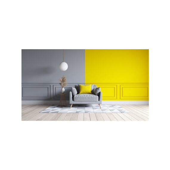
Together, Ultimate Gray and Illuminating Yellow create a complementary bond, providing a courage and hope that is especially important to society in the current situation of uncertainty arising from the ongoing pandemic. The unusual combination of durable gray with the energy of a stimulating yellow creates a deeper sense of nostalgia and thoughtfulness, combined with optimism and a promise of a better future. This color connection is like a marriage of colors spreading hope and strength, as well as a sense of durability and indestructibility.
The benefits of using the colors of the year in interiors
Ultimate gray color is a neutral and safe base for a variety of stylings perfectly matching most of the colors. Gray is a suitable color for any interior, style and decoration. It brings a sense of peace, nobility, stability and a slightly delicate distance to the interior. Similarly to white and black, gray is considered a color representing an elegance, classic and timelessness. Gray can evoke associations with a rainy day, falling dusk or a misty room, that while appearing individually it may bring an aura of sadness and coldness to the interior. The mentioned aura can be easily changed by appropriate selection of an additional color complementing the interior. The gray color emphasizes the coexisting colors, allowing them to shine in the interior and constitute a strong accent, while itself acts as a safe asylum. The color that at first glance has little common with gray, but can complement it in a very interesting way is Illuminating Yellow. The yellow color evoke very positive associations. Thanks to its aura yellow brings energy, motivates to make actions. Regardless of the degree of saturation and shade, yellow enlivens the interior. What is more its lighter variants of yellow additionally enlarge the space. Similarly to white color, yellow perfectly reflects light and thus effectively brightens up rooms. An additional advantage of using yellow in the interior is the improvement of concentration and support of creative processes, as a result of which yellow is considered to be suitable for arranging conference and study rooms.
How to combine together ultimate gray and yellow illuminating?
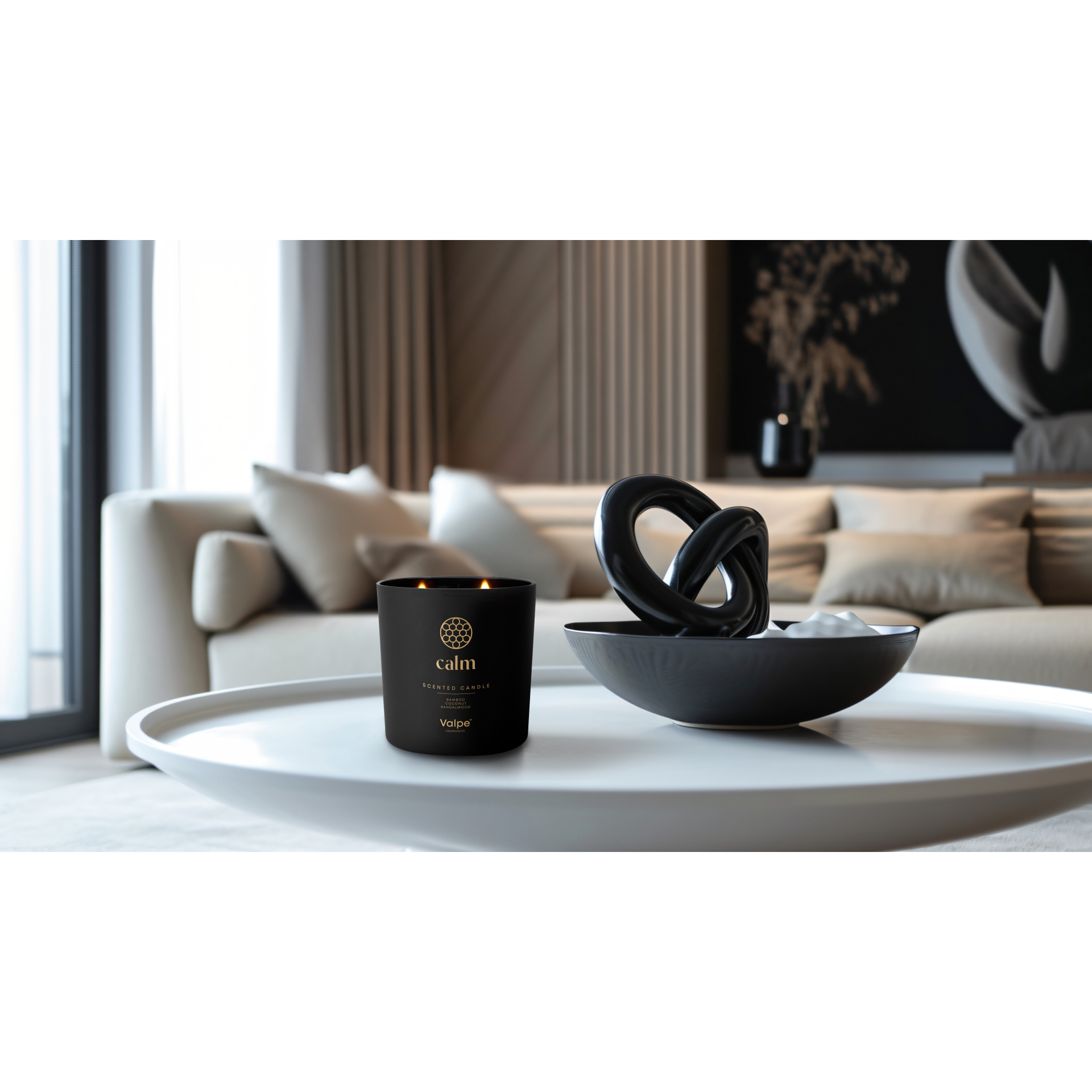
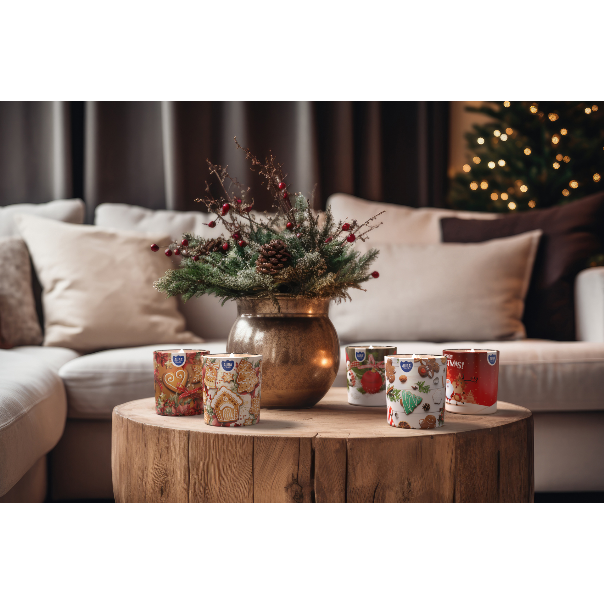
Ultimate gray and illuminating yellow at first glance make an impression of colors originating from two different, mismatched worlds. However, while viewing them closer, they can complement each other perfectly and constitute a peculiar combination. Cool and subdued ultimate gray in the glow of sunny yellow becomes warm and pleasant, while full of energy illuminating yellow in a neutral and elegant gray environment is pleasantly toned. In order to fully use the potential of both colors in the interior of the apartment, it is important to maintain harmony between them, therefore a good solution is to apply the principle of 80% neutrality and 20% color, meaning dominating the interior with shades of grays and complement it with yellow, invigorating accents. Yellow decorative accents can be easily used in all types of pillows, armchairs, curtains, individual pieces of furniture or candles. In case of candles beside their decorative function, the will also envelop the room with a pleasant scent.
